
HOME / BLOG
Find the colors that feel like your team.
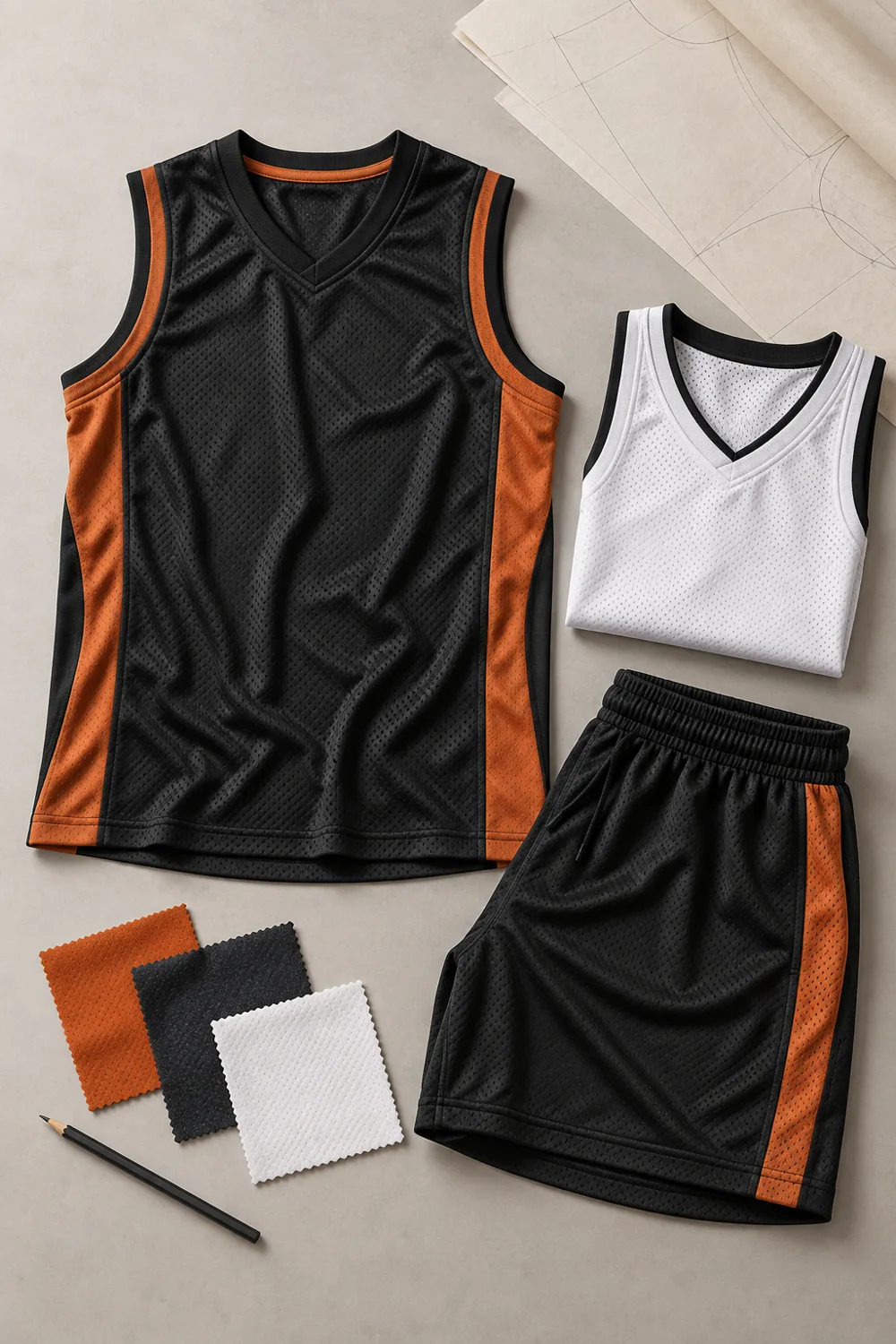
A strong team palette starts with one primary color and a supporting contrast. Think about how the combination looks from the sidelines as well as up close.
XAURA SPORTSWEAR
CHOOSE A PRIMARY COLOR WITH A JOB TO DO
Begin with the color that people already associate with the team, school or organization. If there is no established palette, decide how you want the identity to feel and consider the colors used by opponents or event organizers. A primary color should work across the main jersey, supporting garments and small graphic details. It does not need to occupy every surface to be recognizable.
XAURA SPORTSWEAR
LET CONTRAST DO THE HARD WORK
Pair the primary color with a contrasting light or dark tone so names, numbers and logos remain readable. View the design at a small size as well as close up; a detail that looks attractive on a large screen may disappear from the sidelines. A black-and-white preview can help expose weak contrast, but the final decision should still account for the actual garment and decoration process.
XAURA SPORTSWEAR
GIVE ACCENTS A LIMITED ROLE
Use an accent to connect the neckline, sleeve treatment or side panels rather than making every area compete for attention. Start with one controlled accent and add more only when there is a clear reason. Decide which details should stay consistent across the whole collection. That might be a trim color, a simplified crest or a shared treatment for player numbers.
XAURA SPORTSWEAR
CHECK THE PALETTE ACROSS DIFFERENT PIECES
Look at the jersey and other requested garments together. A color that works on a large body panel may need a different role on a cap or small sponsor mark. If the team requires home and away variations, maintain shared identifying details while meeting contrast rules. Confirm any league requirements before committing to a palette; the design should support those rules rather than force an exception.
XAURA SPORTSWEAR
DESCRIBE COLORS CLEARLY
If your organization has approved brand guidelines, share them along with the original artwork. Explain which colors must remain fixed and which may be adapted. Screens, printed paper and textiles can display color differently, so ask how the proposed color will be reviewed for the final garment. Do not treat a generated concept or an uncalibrated screen as an exact physical color sample.
A PALETTE REVIEW CHECKLIST
- 01The primary color is easy to identify.
- 02Names and numbers stand out against their background.
- 03Accent colors have a clear purpose.
- 04The crest remains legible at its final size.
- 05Required home and away variants have been considered.
- 06The intended colors are documented for the quote.
XAURA SPORTSWEAR
MAKE ROOM FOR THE PEOPLE WEARING IT
Collect focused feedback on two or three clear options rather than asking the team to start from an empty page. Explain which details are required and invite comments on the choices that remain open. After a decision is made, document the palette and use the same reference in every conversation. A consistent brief helps keep the jersey, accompanying pieces and future requests aligned.
BRING YOUR COLORS TO THE CONVERSATION.
Attach approved artwork and describe the palette you want to explore.